icon

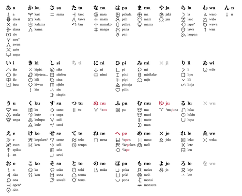
ラテン文字に次いでトキポナ表記に使われる sitelen pona は、固有名詞などを書く時には表語文字の先頭音素を並べるのが標準とされる(例えば sona の /s/ を取る)。どう見ても音節文字の方が似合うので(つまり sona の /so/ を取る)、先頭モーラで字を分類してみた。原則的に Linku の使用率調査(2023)で「core」「widespread」「common」と評価された語を載せたけど、/ju/ だけは稀なので「uncommon」の〈majuna〉まで掘り下げた。

Toki Pona’s syllable structure is like begging to be written in a syllabary (especially with a dedicated glyph for a coda /n/ like Japanese). A bit disappointing that the standard cartouche notation is not designed that way initially.

Attach image
07:41:15
icon

ゴリゴリに日本語みたいな並べ方してみた。表語文字を表音的に使ったので割り当たる文字が複数あるって、まさしく仮名だよな。

Linku というのはこちら。
linku.la/

lipu Linku
07:52:03
icon

@fuopy Hmm, are these diacritic shapes inspired by dakuten and handakuten? The standard nasin is so verbose, no wonder many people seem to have been tweaking it in various ways.

07:59:41
icon

〈majuna〉の文字がフォントに含まれないので〈sin〉を画像編集で逆さにするつもりだったけど、それを忘れて投稿しちゃった。加筆しました。

Edit : I forgot to manually rotate the sitelen for “sin” to get the missing “majuna” glyph.

08:04:26
icon

@fuopy Typeability, that’s an important feature :blobtanuki_draw:

09:35:26
icon

youtu.be/vejvc1dP4xQ

My Life in Gaming のすっごいオタク的な動画、長いけど面白いんだよなあ。

Attach YouTube
21:05:45
icon

ずっと寝てたのだわ…やはり位相ズレが戻っていない。